AI Product Photography Mistakes to Avoid: The 8 Most Costly Traps
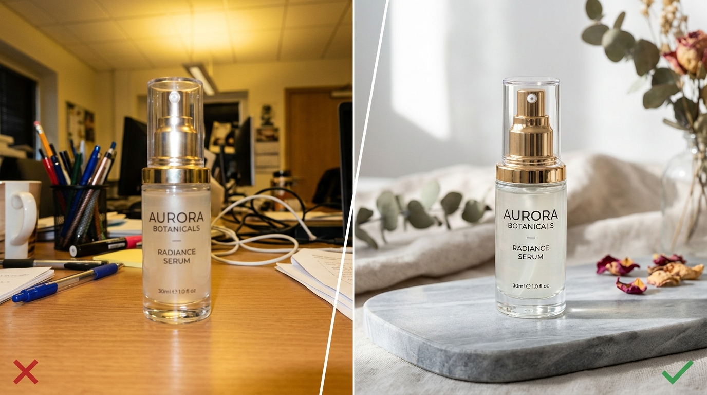
Every few weeks, an ecommerce store owner tests an AI image generator, receives an unusable image with warped branding and strange floating shadows, and concludes: "AI photography is just a gimmick. We still have to spend $3,000 on a studio shoot."
Yet competing brands in the exact same category are using AI photography to publish hundreds of studio-grade catalog listings, test dozens of high-converting Meta ad variations weekly, and cut visual production expenses by over 80%.
What separates successful commercial implementations from frustrating failures? It almost always comes down to avoiding a handful of recurring, predictable mistakes in input preparation, tool selection, and quality assurance. Here are the eight most costly AI product photography mistakes and the exact methods to avoid them.
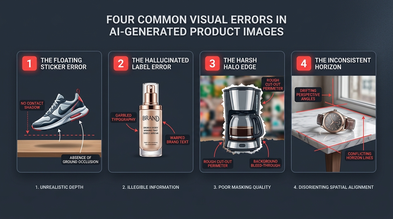
The 8 Most Costly AI Product Photography Mistakes
1. Feeding the AI Low-Resolution, Muddy Reference Photos
AI product photography is an enhancement and staging engine, not a crystal ball. If you upload a blurry, out-of-focus phone photo taken under dim yellow ceiling lamps with harsh cast shadows across the label, the AI's segmentation model cannot distinguish the true edge of your product from the background noise. Garbage in, garbage out.
How to avoid it: You do not need a professional DSLR camera, but you do need clean lighting. Place your product near an indirect window, wipe your smartphone lens clean with a microfiber cloth, use 2x optical zoom to eliminate wide-angle barrel distortion, and tap the screen to lock focus and exposure.
2. Prompting for the Product Instead of the Scene
A classic beginner mistake is typing descriptive prompts about the physical product: "Generate a photo of an amber glass dropper bottle with a gold cap and a white botanical label." When you prompt for the product, you instruct the AI to hallucinate an entirely new object from scratch, guaranteeing altered branding and incorrect dimensions.
How to avoid it: The product already exists in your uploaded photo. Your prompt should describe only the environment, lighting, and surface: e.g., "resting on a smooth travertine stone podium, surrounded by calm shallow water ripples, soft morning sunlight from the right, commercial luxury studio aesthetic."
3. Tolerating the 'Floating Sticker' Contact Shadow Defect
Nothing ruins buyer trust faster than an image where a product appears to float weightlessly above a countertop. This happens when merchants use basic background removal apps that cut out an object and paste it flatly on top of a stock photo without rendering ambient occlusion—the dark, tight shadow directly beneath the physical touchpoint where light cannot reach.
How to avoid it: Ensure your imaging tool computes depth-conditioned contact shadows and directional light falloff (as detailed in our guide to how AI product photography works). Never publish an image where the base of the product lacks a dark contact anchor.
4. Inconsistent Horizon Lines and Camera Heights Across the Carousel
On an ecommerce product page, shoppers swipe through a carousel of 4 to 6 images. If image 1 is shot straight-on at table height, image 2 is shot at a steep 45-degree downward angle, and image 3 is shot from a low upward angle, the visual jumping creates cognitive disorientation and looks disorganized.
How to avoid it: Maintain consistent physical camera height and lens perspective when capturing your reference shots. When using AI scene presets, apply matching surface planes so that your entire image gallery feels cohesive.
5. Ignoring Marketplace White-Background Rules (RGB 255/255/255)
Amazon, Walmart, and Google Shopping have rigid automated compliance algorithms: the primary listing photo must have an uncompressed pure white background (RGB 255, 255, 255). A common mistake is using an AI tool that renders a subtle studio off-white gradient or pale light gray (e.g., RGB 250, 250, 250), which triggers automated listing suppression.
How to avoid it: Use a dedicated tool like SocialShot's marketplace photo creator that mathematically guarantees 100% pure white backgrounds and correct product-to-frame ratios.
6. Generating Without a Cohesive Brand Moodboard
Because AI tools make it effortless to generate infinite creative variations, founders sometimes get carried away: SKU #1 is rendered on dark neon cyberpunk slate, SKU #2 on rustic farmhouse wood, and SKU #3 on minimalist pink marble. The resulting storefront looks like a chaotic flea market rather than an intentional brand.
How to avoid it: Choose two or three complementary surface materials and lighting styles that match your brand identity, and stick to them across your entire catalog. Use bulk product photography to apply unified styling across collections.
7. Distorting Real-World Scale and Physical Proportions
Shoppers rely heavily on product imagery to judge size. If you stage a compact 30ml travel serum next to a coffee cup where the serum appears as tall as the mug, customers will expect a full-sized bottle and feel cheated when a small bottle arrives in the mail.
How to avoid it: Always pair lifestyle images with a clear reference shot or an on-model image that establishes accurate human scale (explore our product fidelity guide for scale benchmarking).
8. Evaluating Exclusively on Large Desktop Monitors
Reviewing images on a 27-inch 4K desktop monitor creates a false sense of security. What looks clear and spacious at 2000 pixels wide can easily turn into an illegible, low-contrast blur when viewed at 300 pixels wide on an iPhone screen in bright sunlight.
How to avoid it: Always conduct your pre-publish quality check on a mobile viewport (following our step-by-step QA inspection protocol) to ensure your product immediately stands out with clear contrast.
Scannable Mistake Prevention Matrix
Keep this summary matrix handy during your catalog creation process:
| Mistake | Direct Commercial Consequence | Operational Fix |
|---|---|---|
| Blurry / Dim Reference Photos | Fuzzy edge halos & loss of fine label text | Shoot near natural window light with 2x optical zoom |
| Prompting for the Product | Hallucinated logos & altered physical dimensions | Prompt only the background surface and lighting |
| Missing Contact Shadows | Uncanny 'floating sticker' effect destroys buyer trust | Use depth-conditioned diffusion with ground occlusion |
| Off-White Marketplace Heroes | Listing suppression & loss of organic search rank | Verify pure RGB (255, 255, 255) with an eyedropper tool |
| Mismatched Carousel Horizons | Disorienting shopping experience when swiping | Standardize camera angle (0° eye-level or 15° slight angle) |
| Chaotic Aesthetic Variety | Erodes brand authority and perceived premium value | Lock 2-3 core studio presets across your entire collection |
The Golden Rule of AI Product Photography
If you remember only one operational principle when scaling your catalog imagery with AI, make it this:
"The physical product is sacred; only the surrounding environment is negotiable."
The moment software begins altering your stitching, modifying your packaging font, or inventing new design elements, it is no longer serving your business—it is generating return requests. Use tools engineered around strict product preservation, and let AI handle the heavy lifting of lighting, background staging, and creative context.
How SocialShot Helps You Avoid These Mistakes
SocialShot's commercial imaging engine was designed to eliminate these failure modes automatically. With built-in alpha matting, ray-traced contact shadows, and strict color-calibration pipelines, SocialShot ensures your product remains 100% authentic while rendering magazine-grade sets in seconds.
Whether you are a solo founder launching on Shopify or an agency managing dozens of ecommerce clients, SocialShot's curated studio presets keep your entire catalog cohesive, professional, and high-converting.
Create mistake-free commercial product photos
Transform phone photos into studio-grade marketplace and lifestyle imagery without product drift on SocialShot AI.
Frequently Asked Questions
What camera settings should I use when taking reference photos on my phone?
Turn off digital filters, portrait mode, and beauty modes. Use 2x or 3x optical telephoto zoom instead of the 1x wide-angle lens to prevent perspective distortion. Tap your product to lock focus and exposure, and shoot with the light source coming from the side or front rather than behind.
Why do my AI images look cartoonish or hyper-glossy?
Cartoonish gloss occurs when models over-smooth surfaces or lack physical ambient occlusion. Using dedicated ecommerce presets that simulate soft diffused daylight and real physical materials (such as raw stone, matte plaster, or weathered linen) creates grounded, believable images.
Can I use AI product photography for complex shiny products like sunglasses or watches?
Yes, provided you control physical glare when taking your reference shot. Place a plain white board opposite your window to diffuse reflections on the glass or chrome. The AI can then synthesize natural environmental reflections consistent with your chosen scene.
How many different background styles should I use on my Shopify store?
Consistency builds brand authority. Top-performing brands typically select one clean neutral style for all primary listing images (e.g., pure white or soft stone cyclorama) and no more than two complementary lifestyle environments across secondary gallery shots.
Is it a mistake to use AI on-model photography for fashion?
Not if you use an apparel-conditioned pipeline that preserves fabric drape, fit, and pattern repeat. Avoid unconstrained art generators that invent new clothing designs; use specialized tools like SocialShot that fit your exact garment onto realistic digital models.
How can I test if my AI product photos are actually converting better?
Run an A/B split test on a high-traffic listing: compare your existing photos against an AI-staged lifestyle carousel for two weeks. Track add-to-cart rate, bounce rate, and return rate to measure the true commercial impact on your bottom line.